
Inside the Monotype Process: How I Create My Prints
Monotype is one of the most painterly forms of printmaking, and it’s also one of the most misunderstood. Over the years I’ve received many questions about how monotypes are made and what makes them different from other types of prints. In this post I walk through the process I use in my practice—from inking the plate to pulling the final print—and share some of the tools and techniques that help bring these landscapes to life.
The history of monotype printing can be traced back to the 1500s with the artist Hercules Seghers, who experimented with color printing on different papers and linen. In the 1600s, Benedetto Castiglione and Rembrandt further advanced the technique, passing it down through generations of artists.
Monotype eventually fell out of favor, largely because multiple prints cannot be pulled from a single plate. It wasn’t until the 19th century that Impressionist artists such as Camille Pissarro, Mary Cassatt, and Paul Gauguin were drawn to the immediacy of the medium and helped bring it back to life.
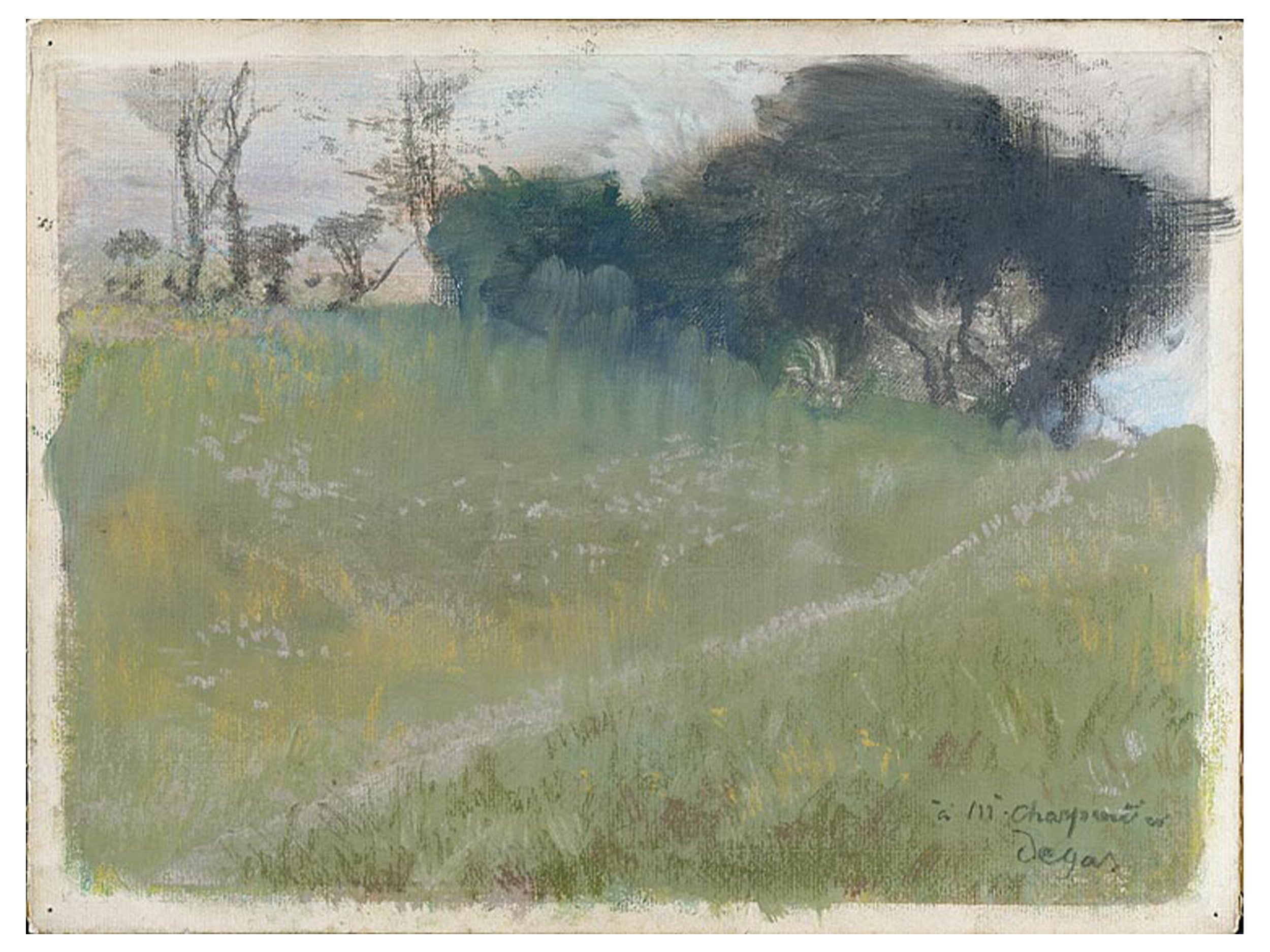
Edgar Degas, Landscape with Path Leading to a Copse of Trees, ca. 1890–92, pastel over monotype in thinned oil paint on laid paper mounted to cardboard, sheet size: 10 5/8" x 14 1/8", plate size: 9 7/8" x 13 3/8" , Thaw Collection, The Morgan Library, NY
It was Edgar Degas, however, who pushed this type of printmaking to new levels. Degas created around 500 monotypes after being introduced to the medium by artist Ludovic Lepic. His fascination led him to approach the process differently, often retouching prints with pastel and experimenting with oil paint instead of traditional printing ink, adding another layer of chance to the process.
His friend and fellow printmaker Marcellin Desboutin once wrote about Degas’s obsession with monotype:
“He is no longer a friend, a man, an artist! He’s a zinc or copper plate blackened with printer’s ink, and plate and man are flattened together by his printing press whose mechanism has swallowed him completely!”
In the years after Degas, many major artists explored monotype, including Pablo Picasso, Henri Matisse, Milton Avery, Adolph Gottlieb, Richard Diebenkorn, and Robert Motherwell. Each approached the medium differently, expanding its possibilities.
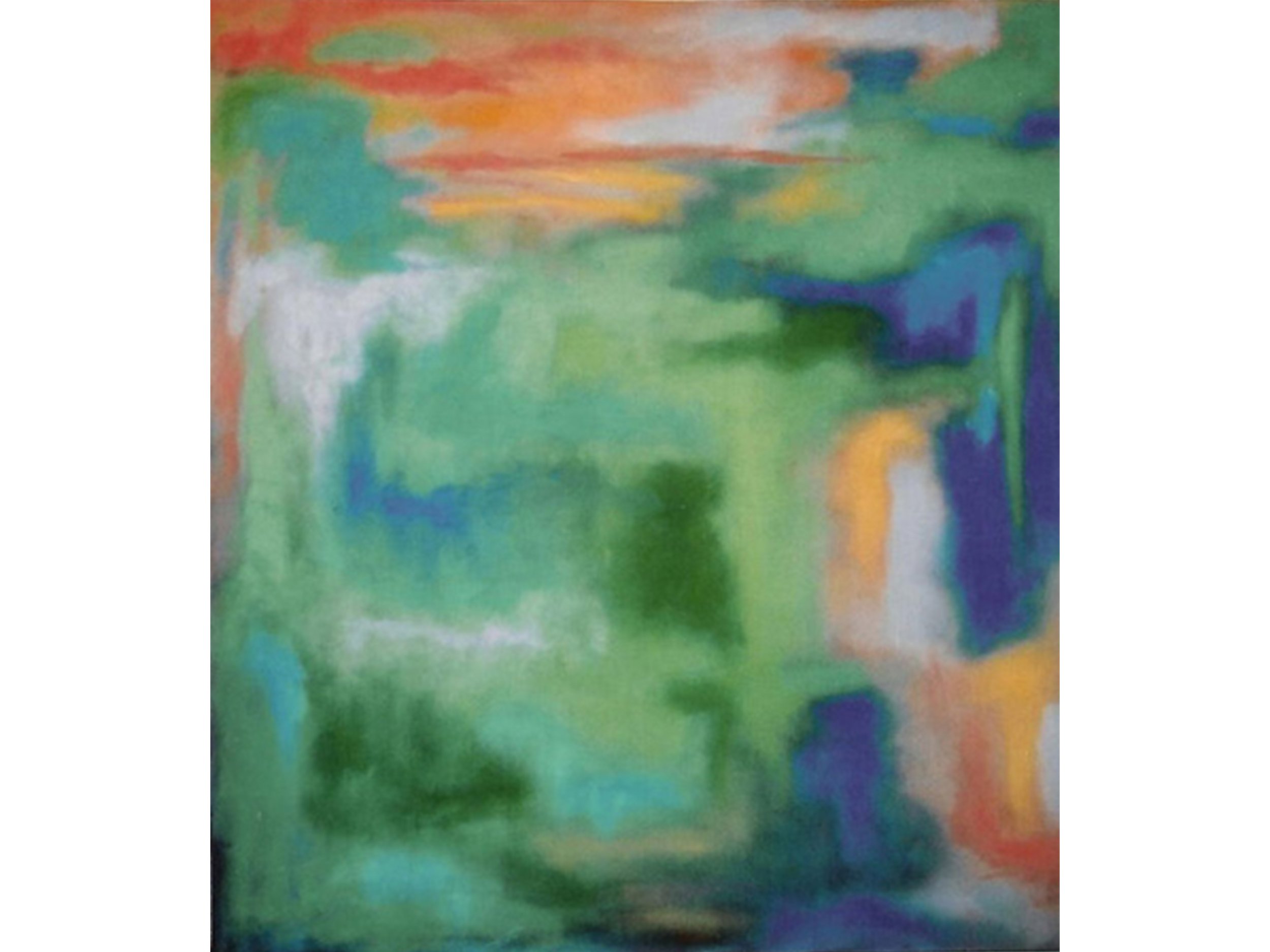
Luis Colan, Lessons with Matisse, 2003, oil on cotton canvas, 60 × 54 inches
I was first introduced to monotype in college under the tutelage of painter and printmaker Fred Wessel. I was immediately drawn to its painterly quality, which suited my needs at the time as an abstract painter. My process then involved applying colored ink to a linoleum block covered with waxy paper or acetate, mixing colors directly on the surface and building a composition there.
After that semester in the early 2000s, I didn’t return to printmaking for quite some time, though the idea stayed in the back of my mind. In 2014, through the Salmagundi Club, I was able to revisit monotype. This time around I was completely hooked, and it has since become a major part of my artistic output.
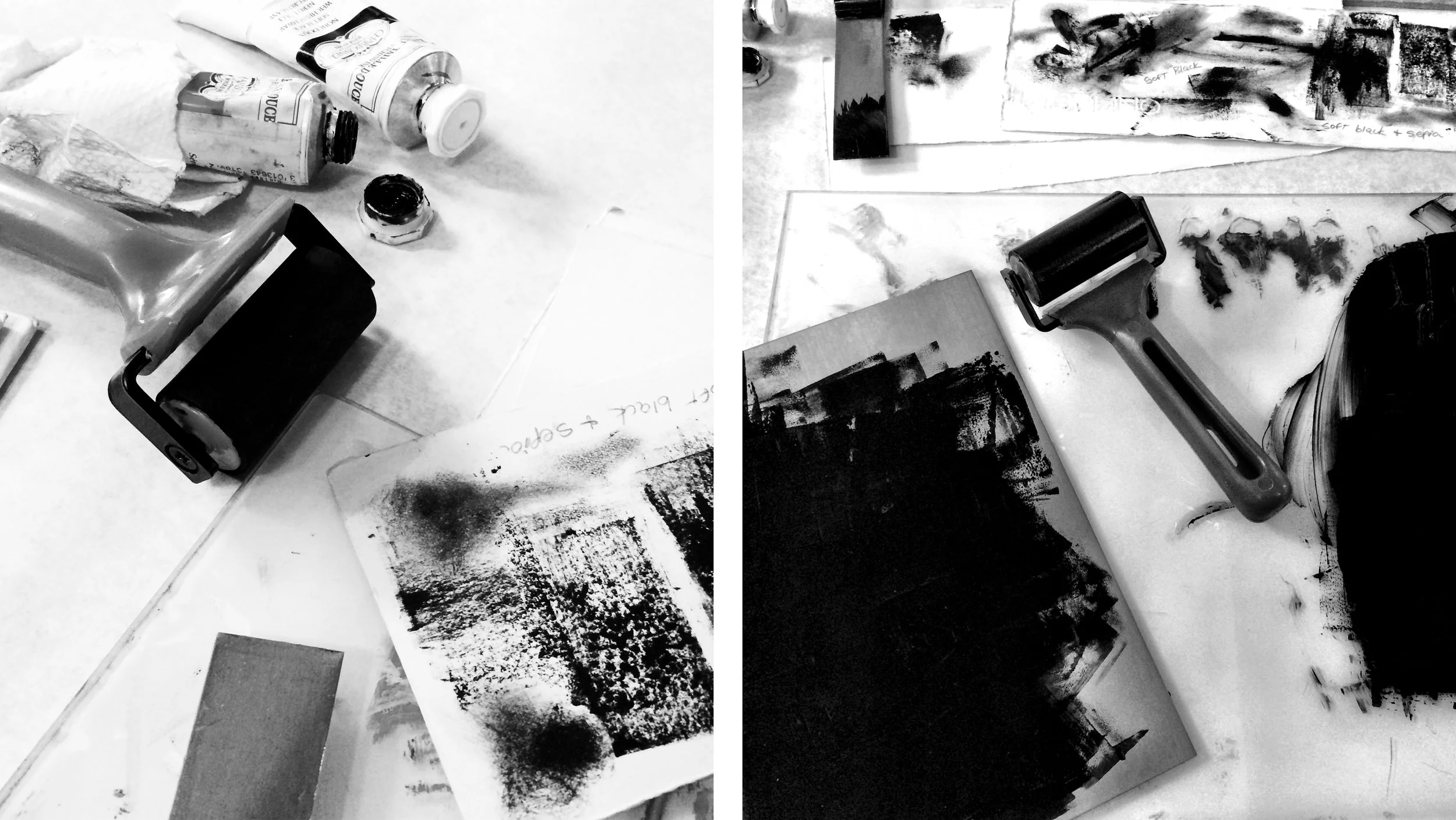
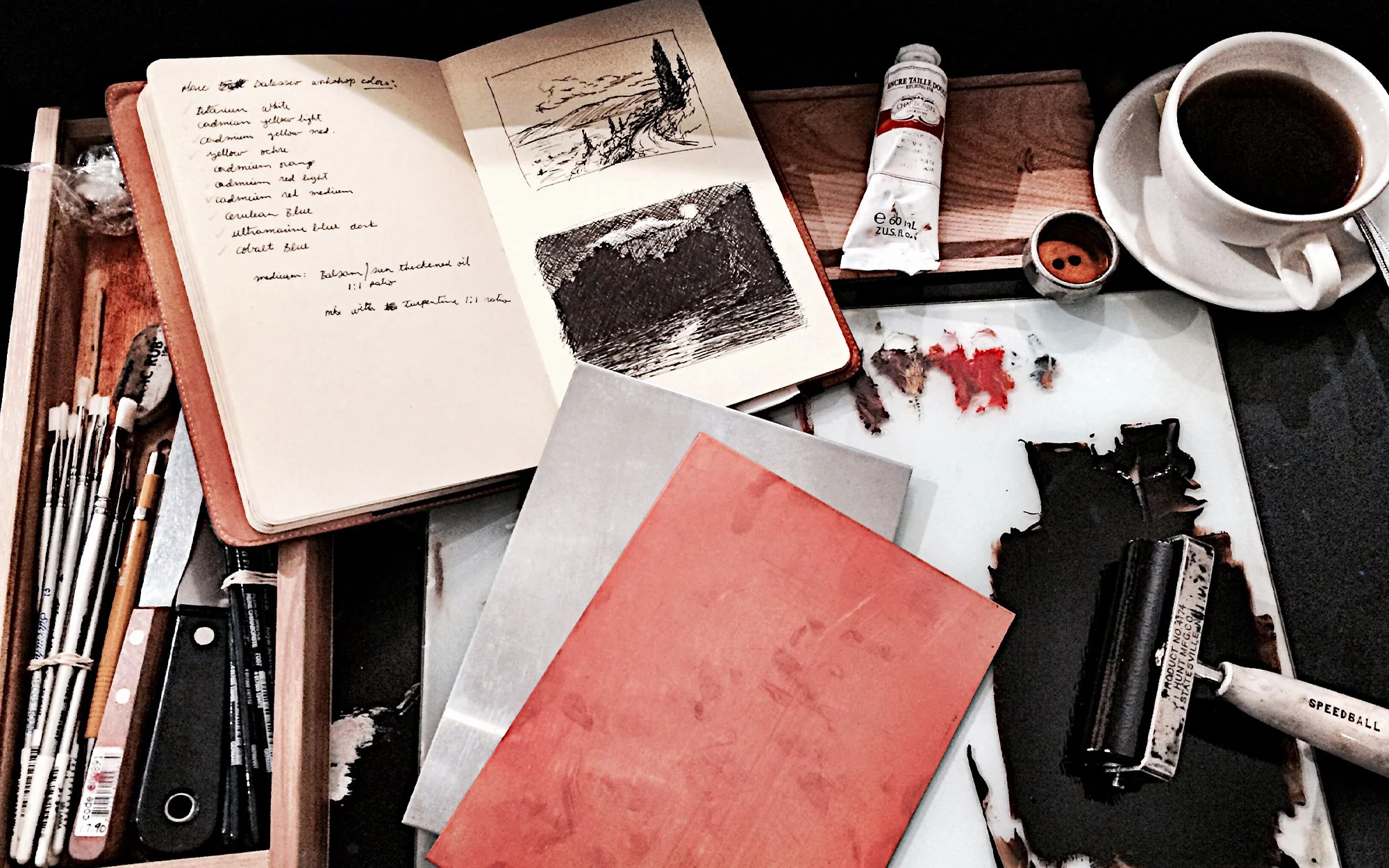
My approach to monotype is known as the dark-field method, which begins with a surface—usually a copper plate in my case—covered with ink, most commonly black. Over the years I’ve developed different color mixtures to keep the work fresh. The image is then “carved” out of the ink by wiping away the areas that will become white in the finished image. It’s essentially a subtractive drawing process.
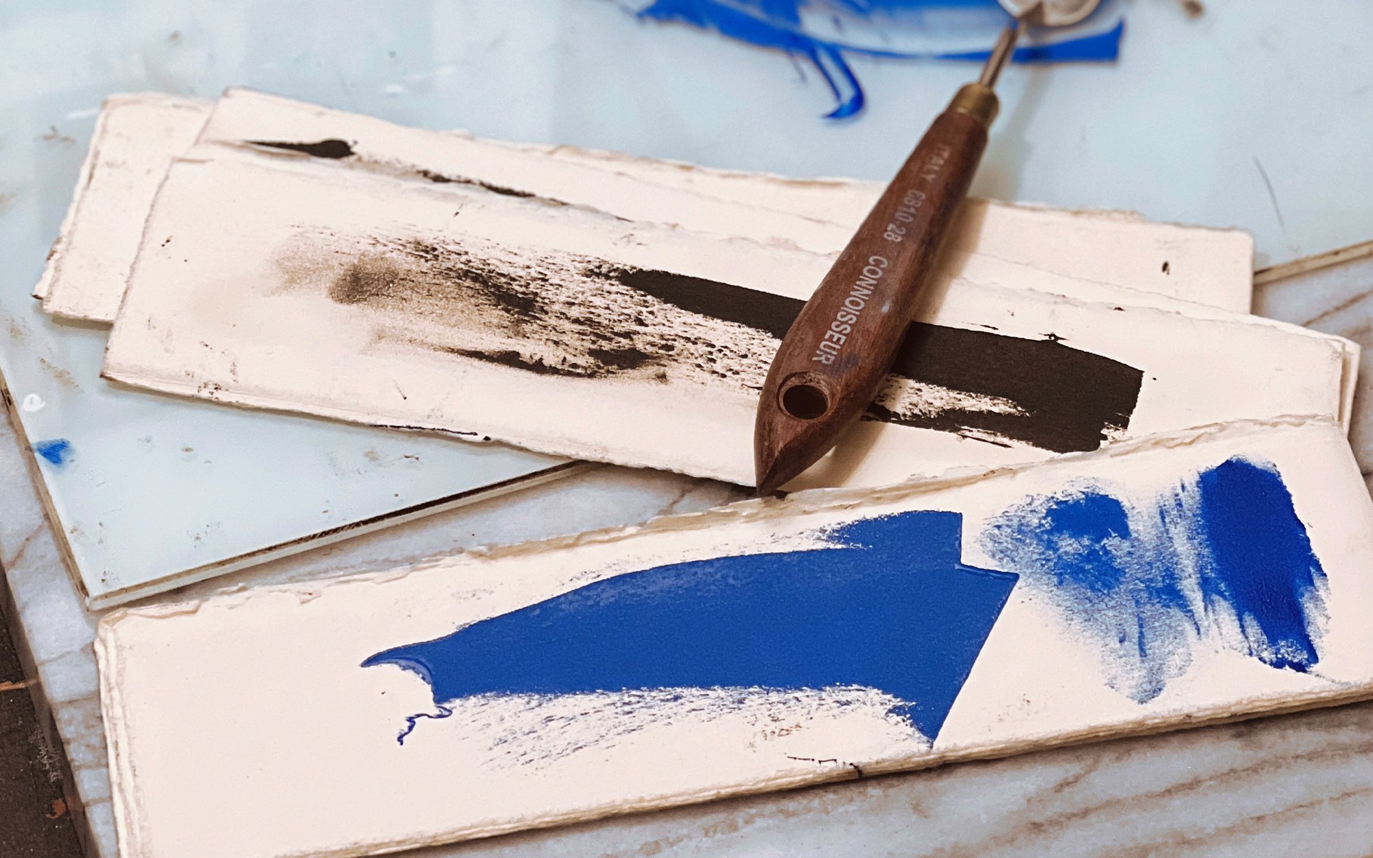
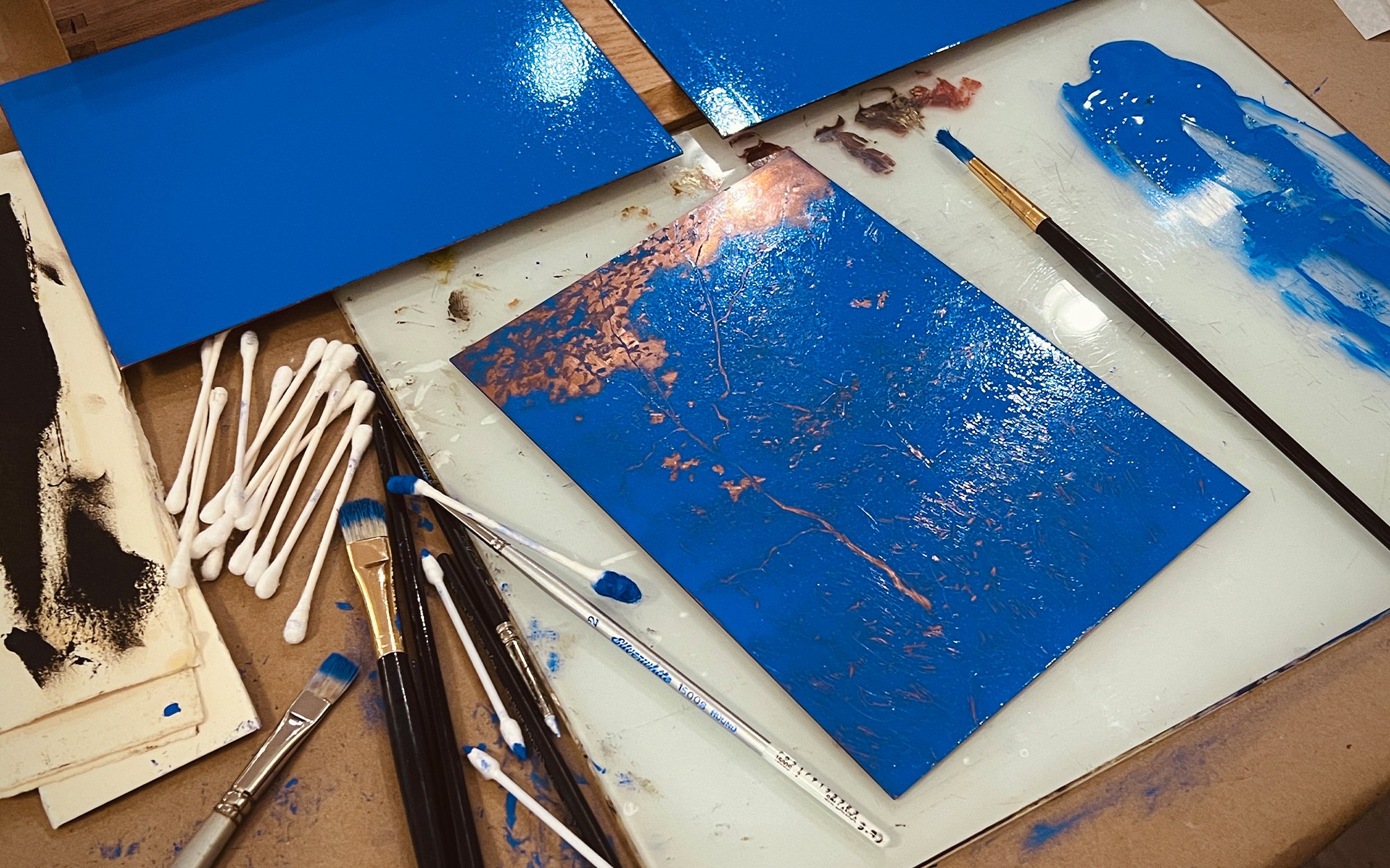
Once I mix my ink and test it on paper, I cover the plate using a brayer. The goal is to create an even, thin layer of velvety ink across the surface. If too much ink is applied, the pressure of the etching press can push it outward, creating blobs or smears in the final print. A thinner application almost always produces better results. It’s worth remembering that even a small amount of ink can provide strong coverage.
Once the plate is prepared, I begin by loosely drawing into the surface using a wooden BBQ skewer or a fine-tip clay shaper. The end of a paintbrush works just as well if those tools aren’t available.
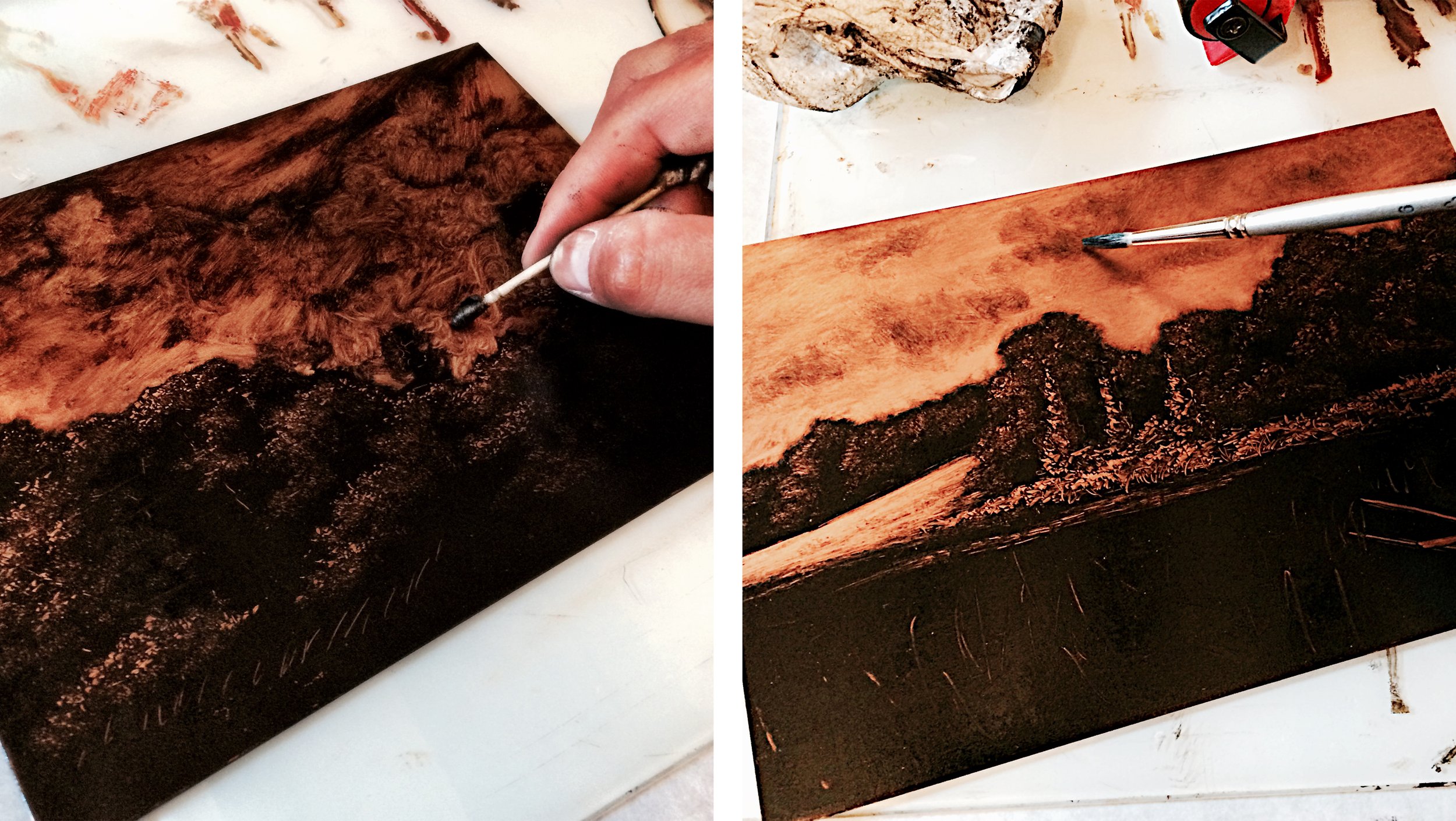
After the initial drawing is established, I start removing ink using various tools. Cotton swabs are especially useful for lifting larger areas and can also produce interesting textures. Rags, paper towels, and cosmetic sponges work well too—anything with an absorbent quality can be helpful.
From there, I begin refining the image with a soft white synthetic brush, always wiping excess ink from the brush after a few strokes. This technique works especially well in the sky, where clouds and atmosphere can blend softly.
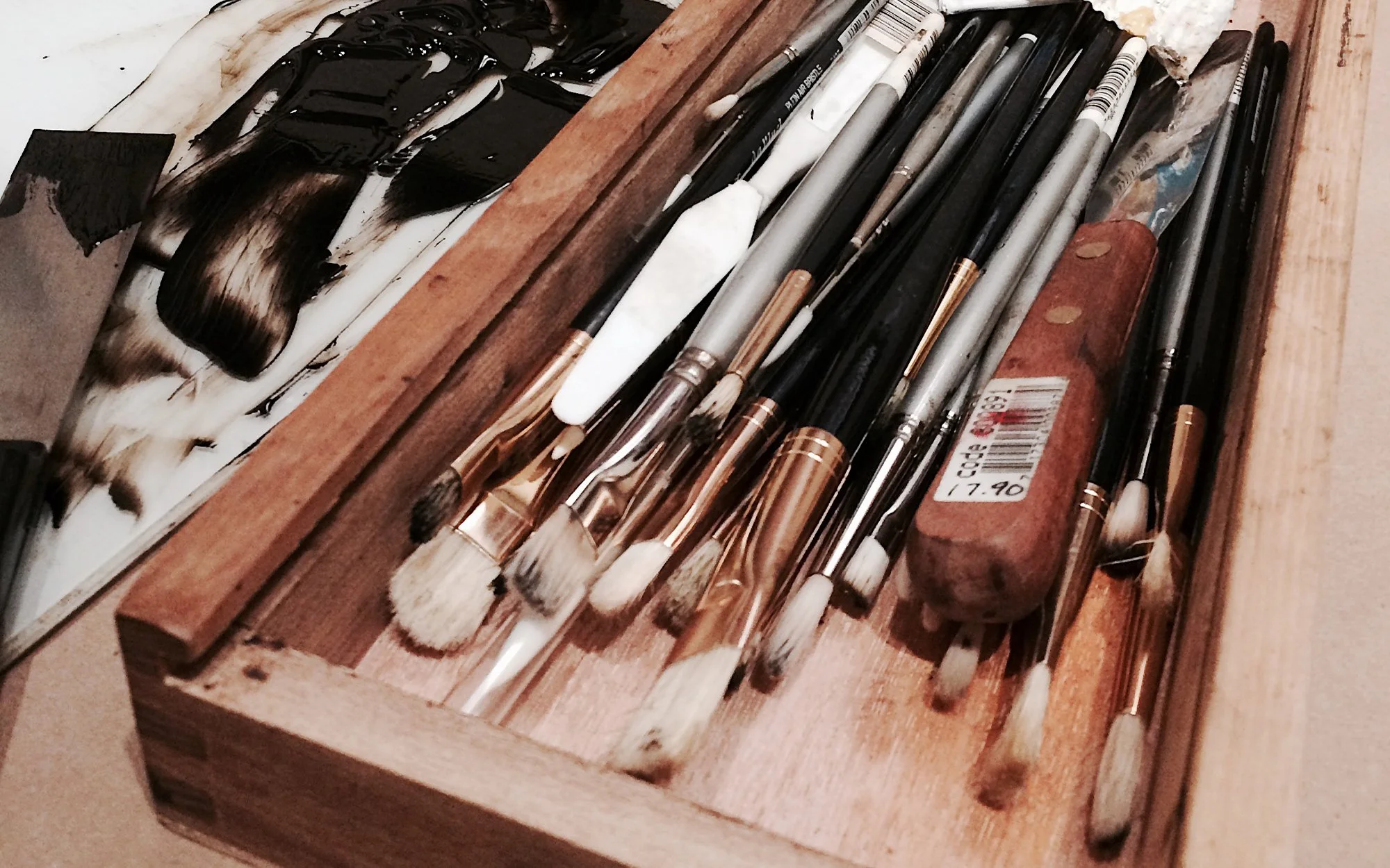
The textures of trees and foliage are often created by dabbing the surface with a hog bristle brush or by pouncing a cotton swab on its side. For trees that recede into the distance, I tend to use a filbert-shaped brush. As with the synthetic brush, I wipe it clean regularly so it continues to lift ink from the plate rather than simply pushing it around.
For grassy areas, I use either a round or flat hog bristle brush, dragging it upward instead of dabbing to create the effect of blades and movement.
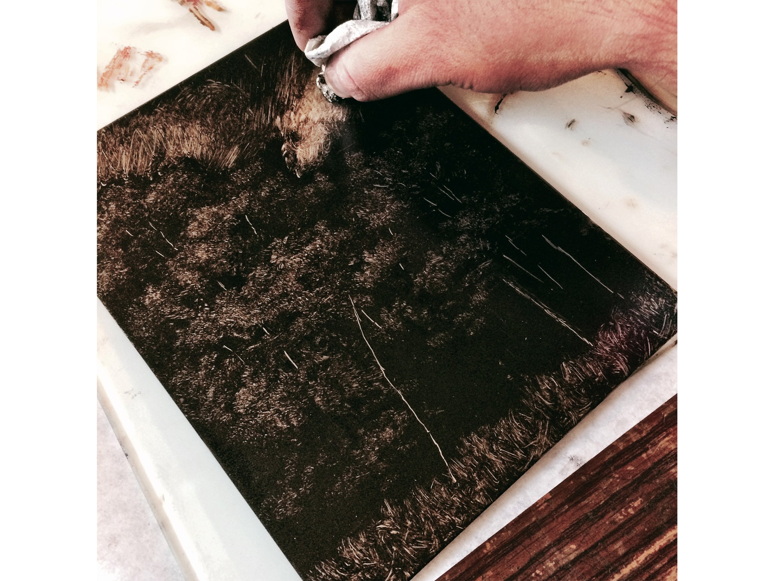
In the image above, I’m working with a bunched-up paper towel. I discovered this technique one day when I was trying to develop an image quickly, and it worked almost like magic. The irregular texture of the paper towel creates convincing foliage, especially in areas closer to the foreground.
To add details such as tree trunks or small highlights on leaves, I use a round-tip clay shaper (also called a color shaper). This tool removes ink cleanly and allows for sharp, controlled lines.
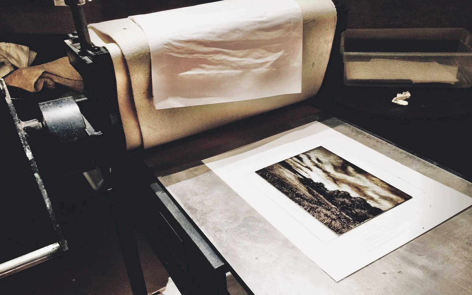
Once I’m satisfied with the image, the plate goes under the press. At this point you have to be prepared for surprises. Sometimes areas print darker than expected, or details made with the clay shaper produce stronger contrast than anticipated. Either way, the final print reveals what truly worked.
One important thing to remember is that everything prints in reverse. When planning your image—especially if there is writing involved—you have to keep this in mind.
There are many different ways to create monotypes, and this is simply the method that works best for me. One of the great things about the process is how open it is to experimentation.
Some artists work on plexiglass so they can place white paper underneath while drawing, helping them visualize how the values will print. Others incorporate natural elements such as leaves, or even inked plastic wrappers, pressing them into the plate to create unexpected textures and shapes.
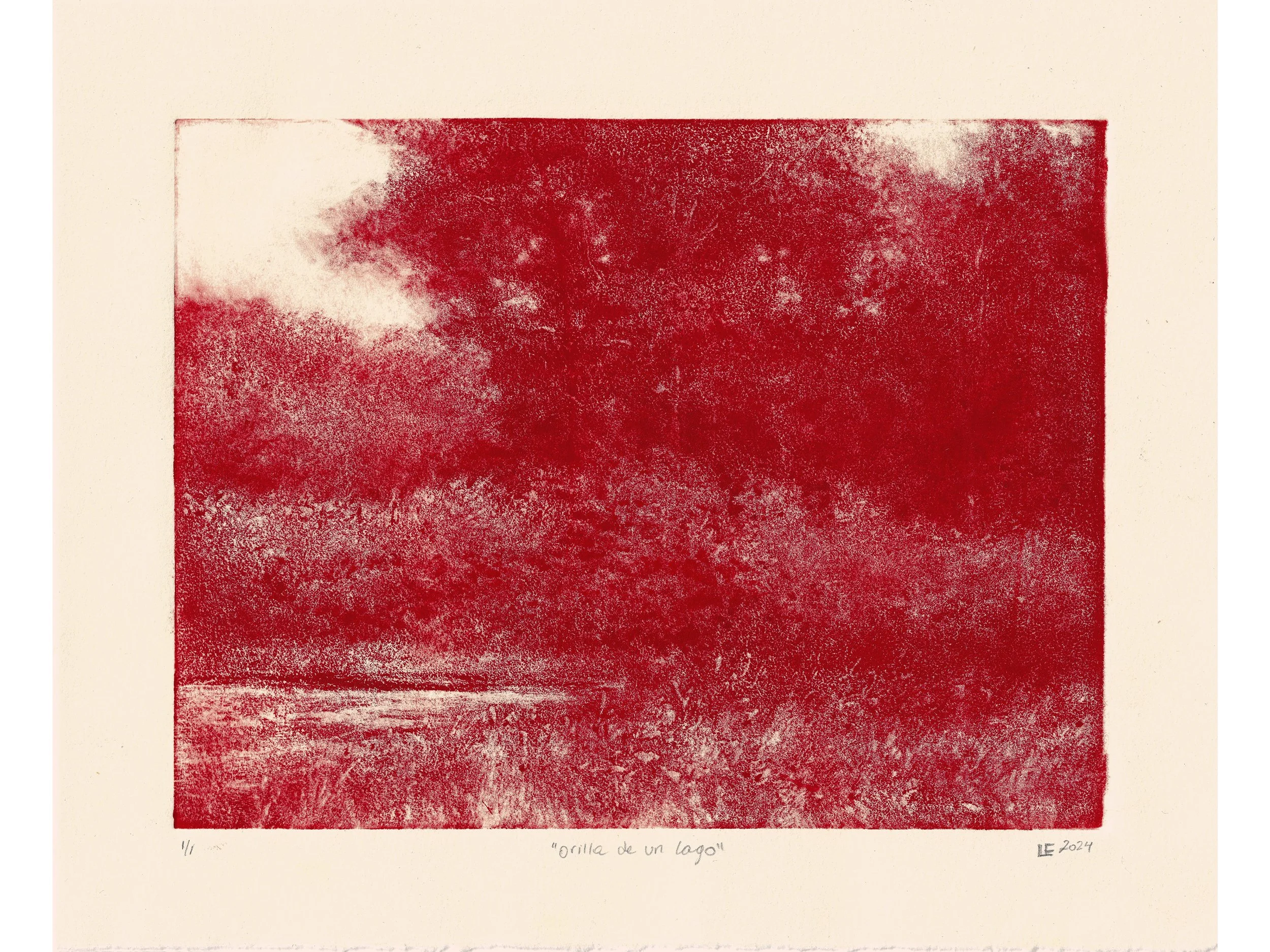
Luis Colan, Orilla de un Lago, 2024, monotype on Rives Heavyweight paper, image 8 x 6 inches, sheet 8 x 10 inches - print created using a doorknob.
You don’t even need a printing press. A monotype can be transferred by rubbing the back of the paper with a smooth tool like the back of a large spoon or even a doorknob. The image will usually appear more grainy since the pressure is lower, and it takes quite a bit of elbow grease to achieve a deep transfer, but it can still produce interesting results.
In the end, I always encourage people to experiment. Trying different tools and materials is part of what makes monotype such a rewarding and exciting process.
The process of monotype continues to surprise me every time I pull a print from the press. That balance between control and unpredictability is part of what keeps me coming back to it year after year. Many of the prints created through this process since 2014, will be featured in my upcoming book 1/1: Monotypes, which will be published in the coming weeks by ISSI Éditions.
View available monotypes here.