
The Pull of the Plate: A Decade in Monotype
This post accompanies the upcoming book 1/1: Monotypes (read One of One), to be published in 2026 by ISSI Éditions, a French fine-book publisher based in Lille. Known for producing limited-edition books on art, photography, and culture, ISSI Éditions is dedicated to carefully crafted publications that tell meaningful visual stories. 1/1: Monotypes brings together ten years of my monotype work into a single volume, tracing the evolution of a process built around singularity, chance, and commitment.
Change has never come easily to me. I’m a creature of habit, and new beginnings often arrive with doubt and hesitation. Still, change is necessary. At some point, you have to step into unfamiliar territory to move forward. For me, that turning point came through monotype printing.
I was first introduced to monotype as a student at the Hartford Art School. Among all printmaking processes, it felt closest to painting—immediate, physical, and responsive to the hand. The process stayed with me, but it wasn’t until February of 2014, at a Monotype Party at the Salmagundi Club in New York, that it fully took hold.
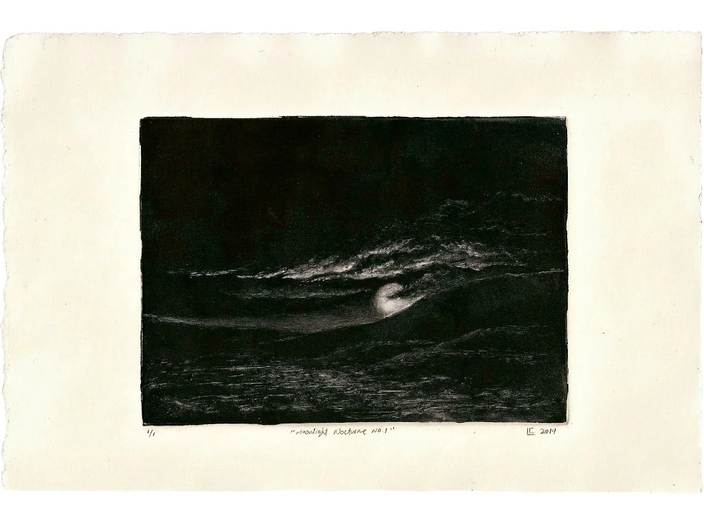
Moonlight Nocturne No. 1, 2014, monotype, image 5 x 7 inch, sheet 7 1/2 x 11 inches, Private Collection
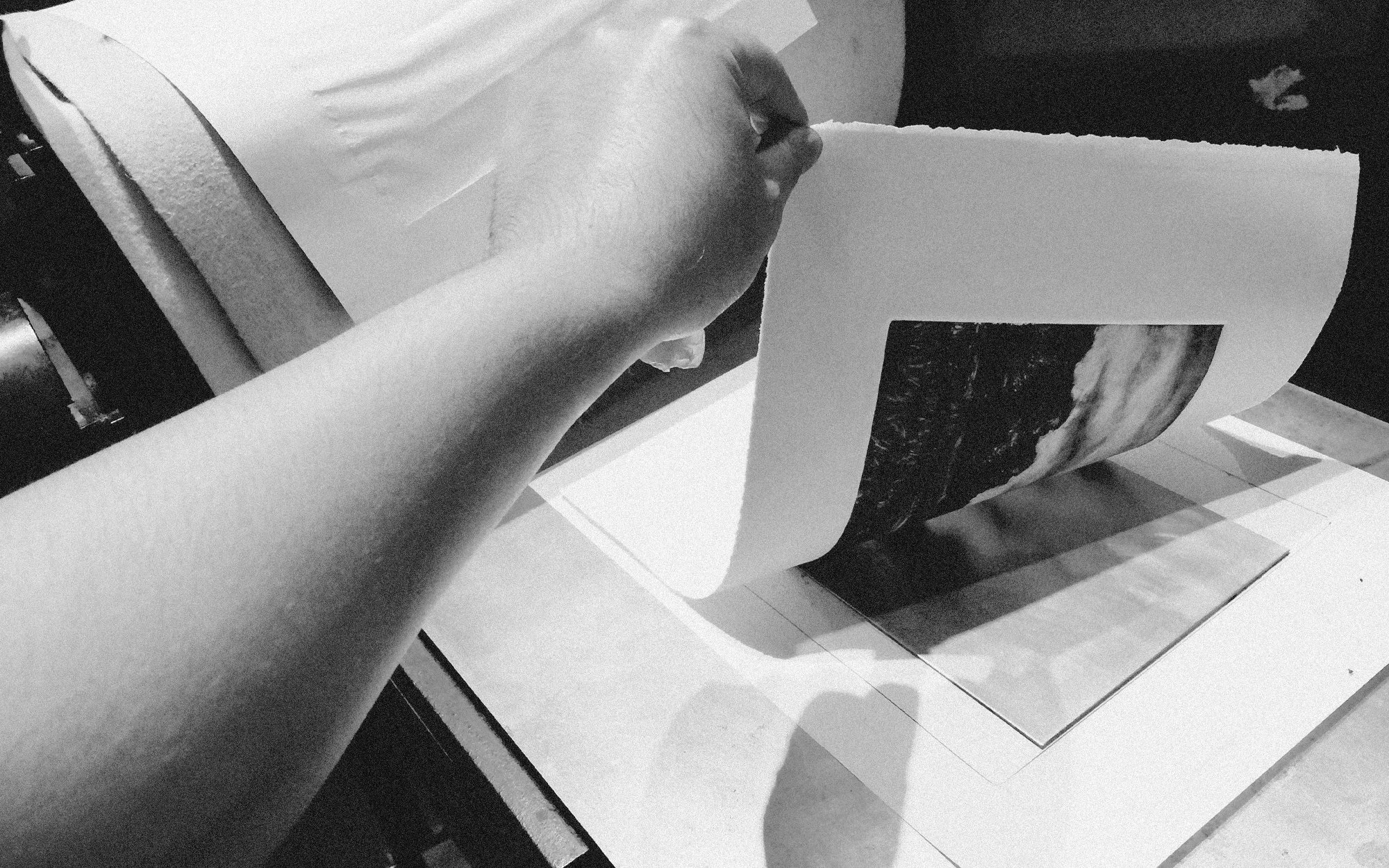
That night, I worked subtractively for the first time, removing ink from a darkened plate to reveal light. Using a moonlit landscape from my sketchbook, I drew clouds and a full moon out of black ink with cotton swabs. When the plate went through the press and the paper was lifted, the image appeared all at once—resolved, unexpected, and complete. I knew then I had found something lasting.
Since that moment, monotype has become central to my practice. It sits somewhere between control and surrender. Like plein air painting, it demands decisiveness. There is no revision, no edition—only one impression. Each print is an act of commitment, shaped equally by intention and accident. That tension continues to draw me back.
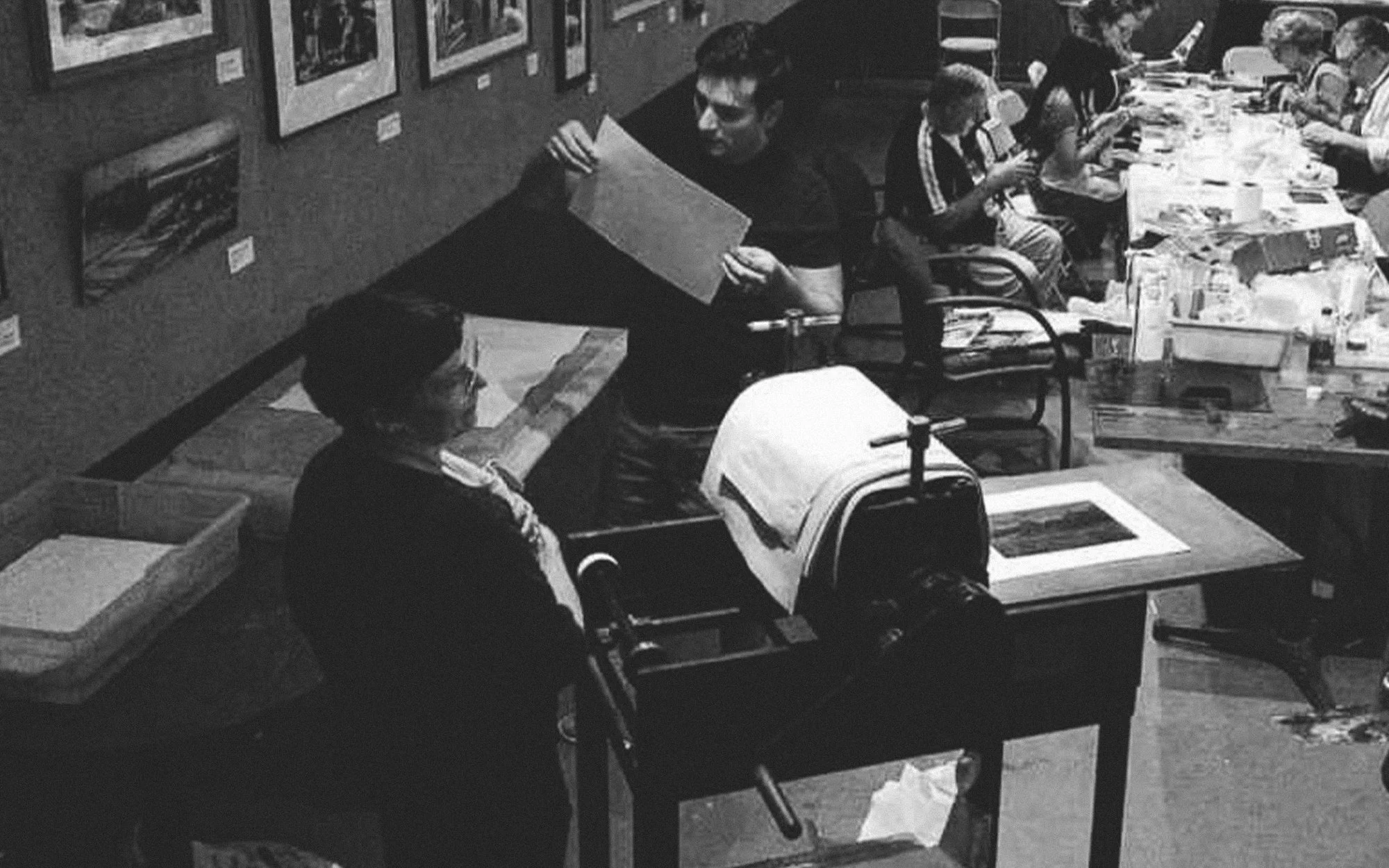
Without a press of my own, I began printing regularly at Salmagundi, treating each monthly session as focused studio time. Working in the club’s lower gallery, I print steadily among the hum of conversation and the smell of ink, often juggling multiple plates to make the most of the session. Printing there connects me to a long tradition: between 1888 and 1929, artist members held Monotype Dinners in the same space, clearing copper plates after supper and printing late into the night. Being part of that lineage matters to me.
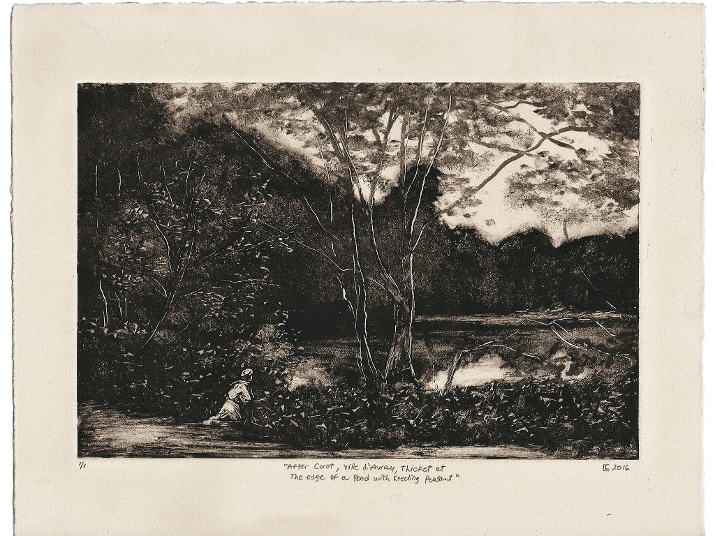
After Corot, Ville d'Avray, Thicket at the Edge of a Pond with a Kneeling Peasant, 2016, monotype, image 6 x 9 inches, sheet 8 1/2 x 11 inches
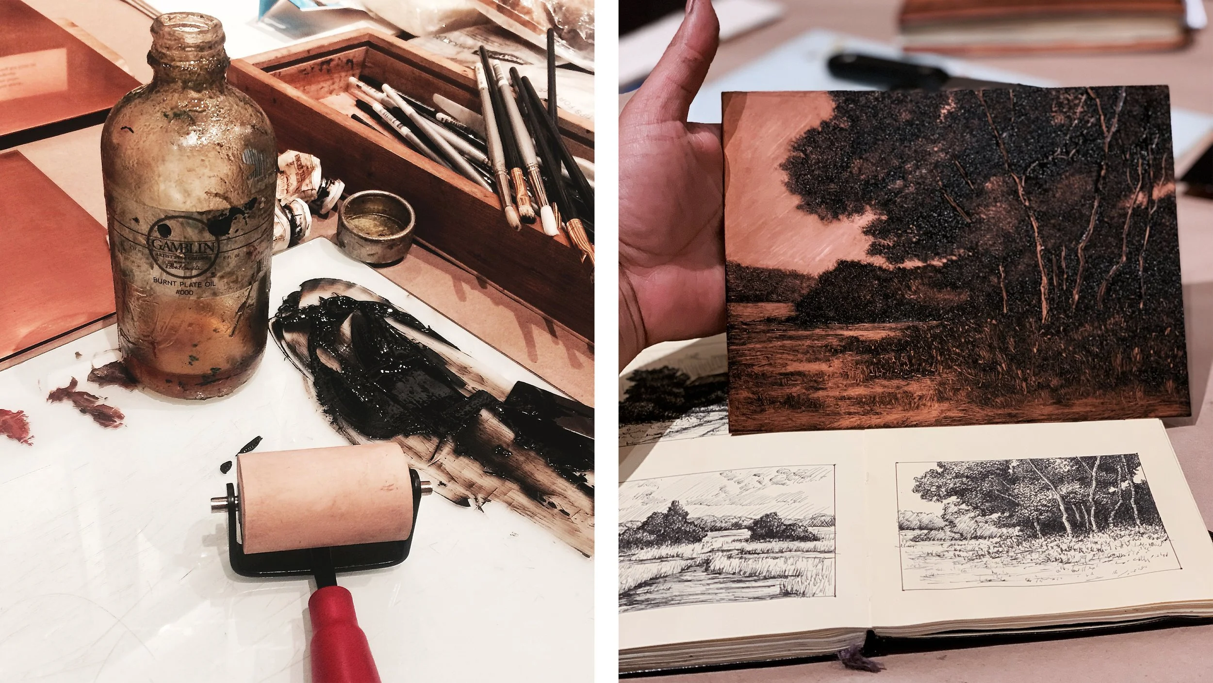
Over time, monotype expanded the way I think about landscape. Some prints grow from memory, others from quick drawings or plein air paintings translated onto the plate. The process allows me to distill a place into atmosphere rather than description. In 2016, I made a monotype after Corot—not as imitation, but as a way to step inside one of his compositions and understand it through my own hand. These quiet conversations with art history continue to inform my work.
As confidence grew, I began letting go of pre-planned compositions. One crowded night near the end of a session, I worked quickly and instinctively, dabbing ink with a crumpled paper towel. A dense stand of trees emerged almost on its own. That moment became the beginning of the Arbolado series, an ongoing body of work rooted in intuition and repetition.
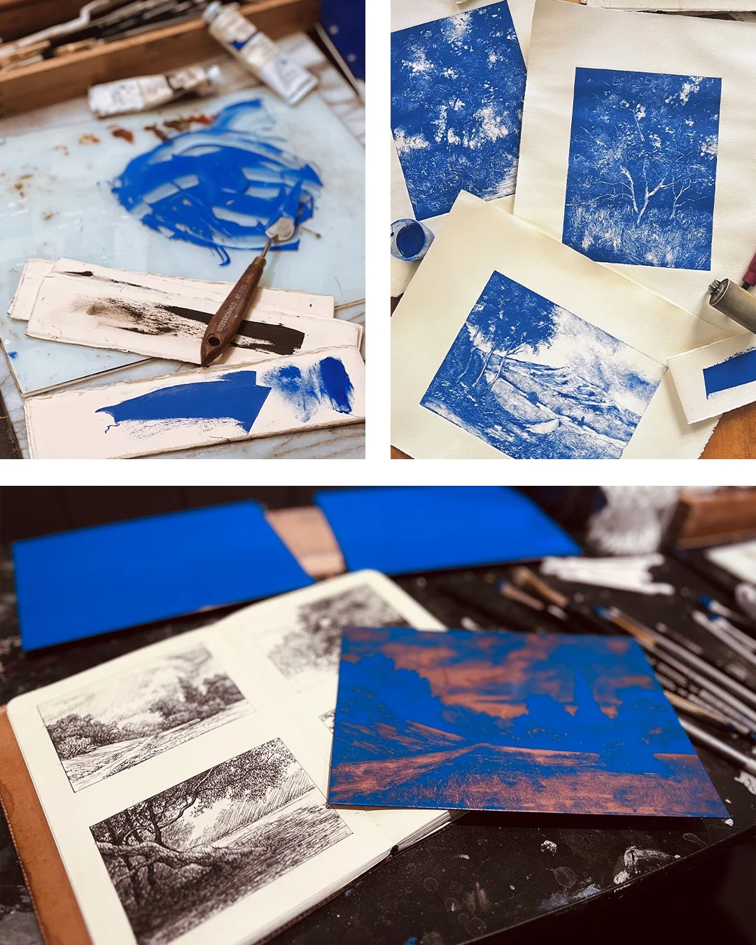
By the end of 2022, after years of working primarily in dark monochrome, I felt the need for change. Blue entered the work gradually, influenced by years of sketching in blue ink, Corot’s silvery landscapes at the Met, and later, the Delft blues and luminous interiors I encountered while traveling in the Netherlands. When blue finally appeared in my monotypes, it shifted the work away from a purely historical register and into something more contemporary.
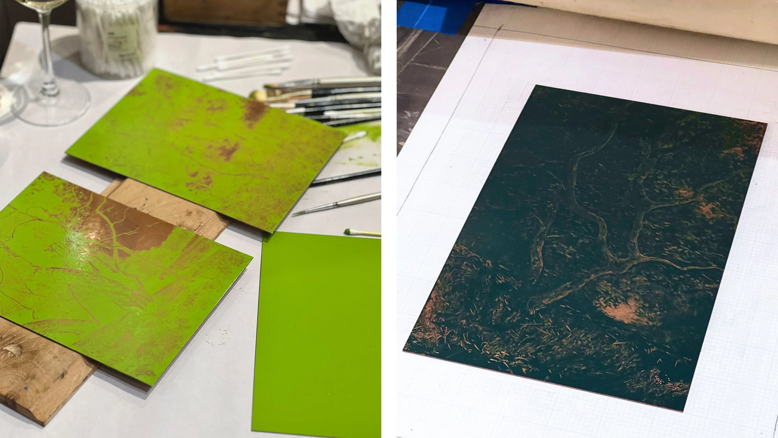
Color continued to evolve. In 2024, I began exploring green—searching for a tone that felt alive but restrained, modern but grounded. Then, in 2025, I introduced a muted grey-blue-green inspired by Vivianite, often referred to as “Blue Ochre.” By mixing Cerulean Blue, Raw Umber, and Titanium White, I arrived at a somber, luminous color that felt inward and reflective. These prints became less about specific places and more about internal landscapes—quiet, nocturnal, and contemplative.
More than ten years after that first print, the process still feels charged. Every time I lift the paper from the plate, there’s a moment of uncertainty. Monotype has taught me humility. There is only one pull, one chance, one unrepeatable image. That limitation is its power.
The plate never gives you exactly what you expect—and that’s the point. I return to monotype not for mastery, but for discovery. Each print is a negotiation with impermanence, and within that surrender, something honest can emerge.
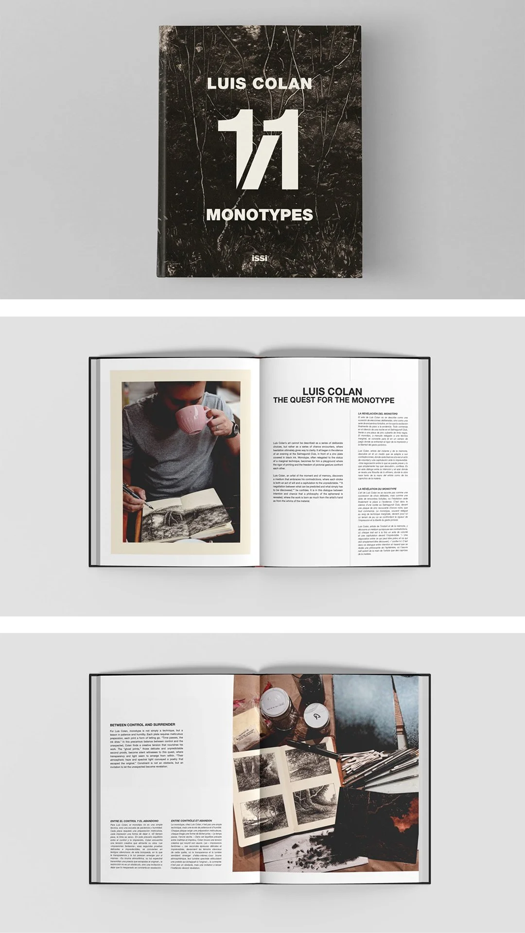
Preview of upcoming book Luis Colan: 1/1 Monotypes by ISSI Éditions