From the Archives - Red: The Color of the Times
From the Archives
This post is part of my From the Archives series, where I revisit earlier writings that continue to resonate with my current practice. While written a few years ago, I find the themes and reflections here remain relevant today, both in my work and in how I think about the role of art in uncertain times.
Red: The Color of the Times
July 27, 2020
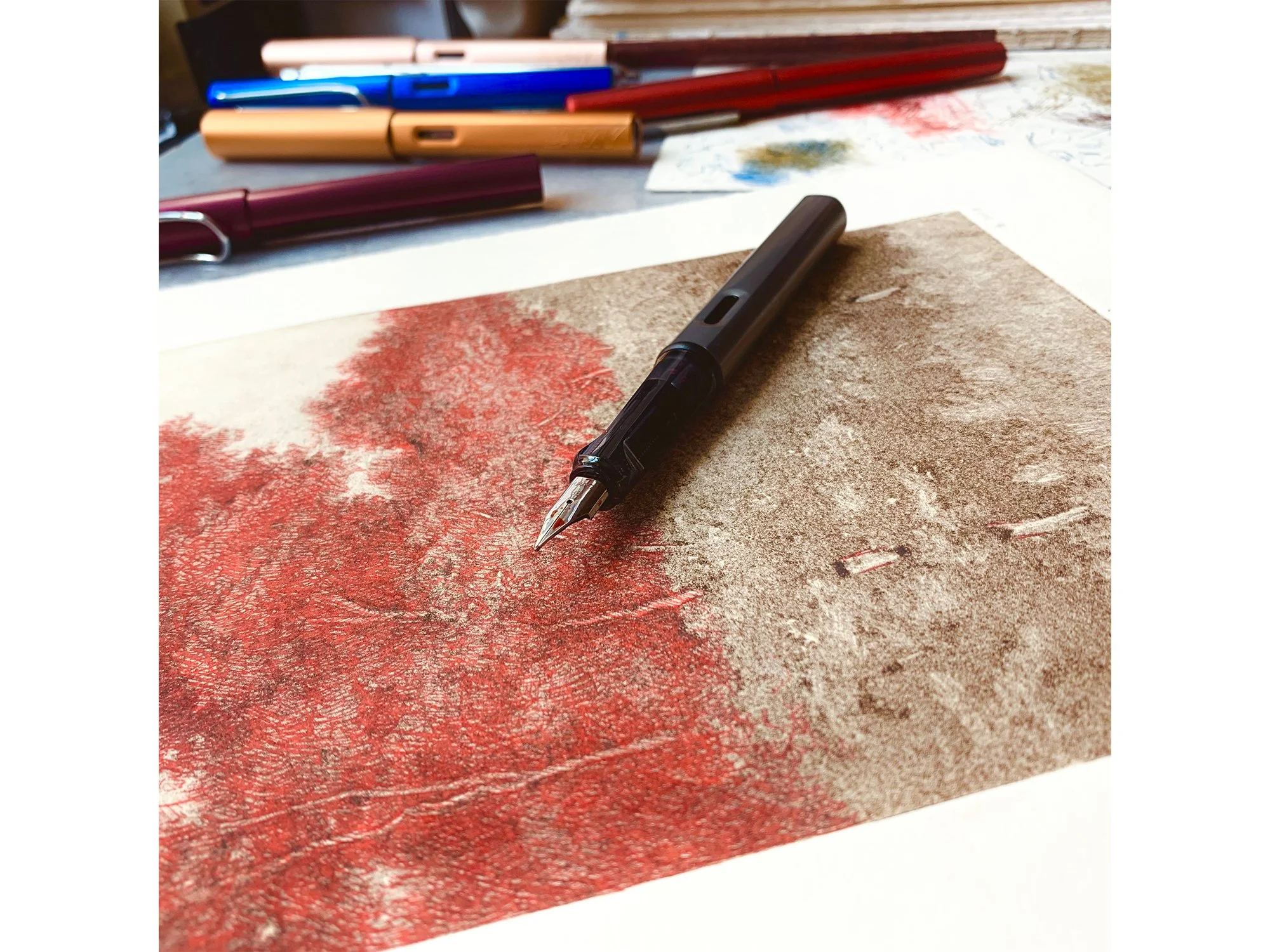
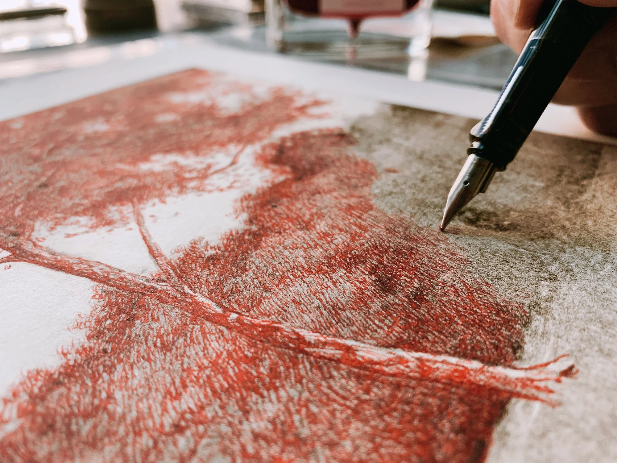
At the beginning of the year, I began experimenting with drawing on top of my ghost prints. I wrote a post about that process, which you can see here. But it wasn’t until March that the work began to take on a deeper meaning.
As the COVID pandemic spread through New York and across the U.S., a group of artist friends and I started meeting on Zoom to check in—on our well-being, our work, and the new world we were suddenly navigating. Before I get into the work itself, I should say a little about who these artists are.
A few years earlier, a group of Queens-based artists began meeting for monthly critiques in our studios and living rooms. These “crits,” as we called them, were more than just formal feedback sessions. They were evenings filled with conversation—about art, about the lives we shared in common—and, more often than not, plenty of laughter and a good supply of wine. For all of us, these gatherings were invaluable. Sometimes the insight of a peer can spark exactly the breakthrough you’ve been struggling toward. Over time, the group shifted as members moved away, but when the world shut down in 2020, we found ourselves drawn back together virtually. We knew both our lives and our practices were being reshaped, and we wanted to respond in some way. Out of those conversations, The QNS Collective was born.
We launched with an online exhibition and virtual gallery tour called Terra Incognita. Each of us created new work exploring the idea of maps, uncharted territories, and the shifting earth beneath our feet. It was our way of responding to a global crisis using the language we knew best—art.
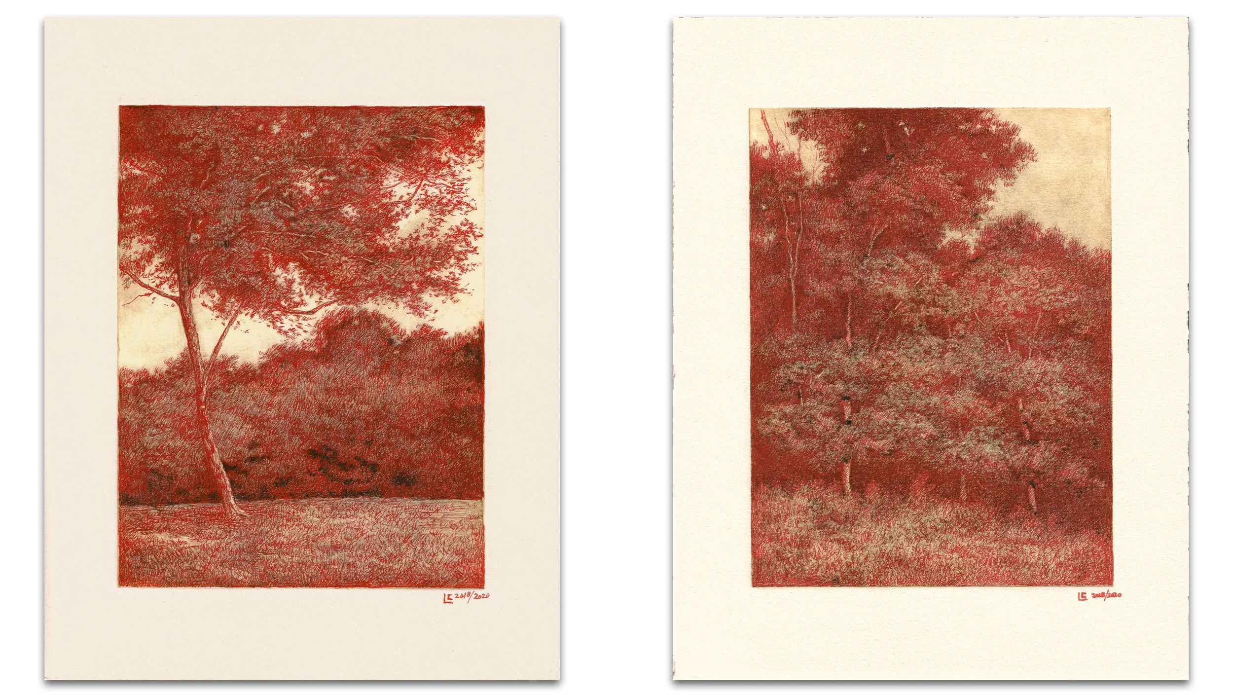
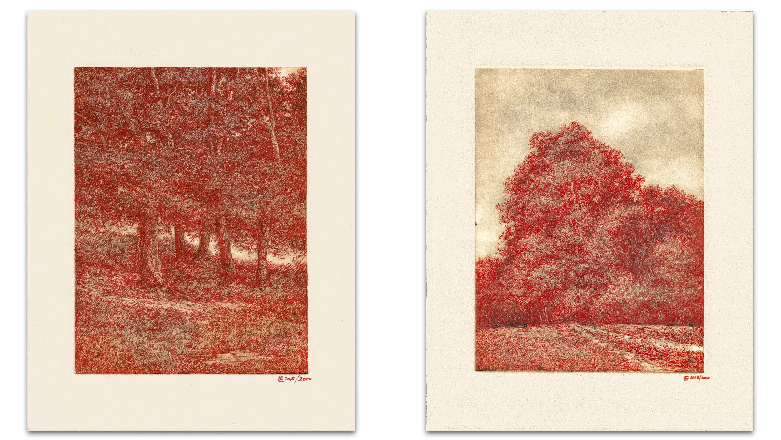
As I developed my drawings for the exhibition, I kept returning to the color red and what it symbolized at that moment. Every news report seemed marked by it—maps covered in red dots tracking the spread of the virus, diagrams of the virus itself glowing in red, and of course red as the universal color of danger and emergency. It struck me that red could stand in as a metaphor for the times we were living through.
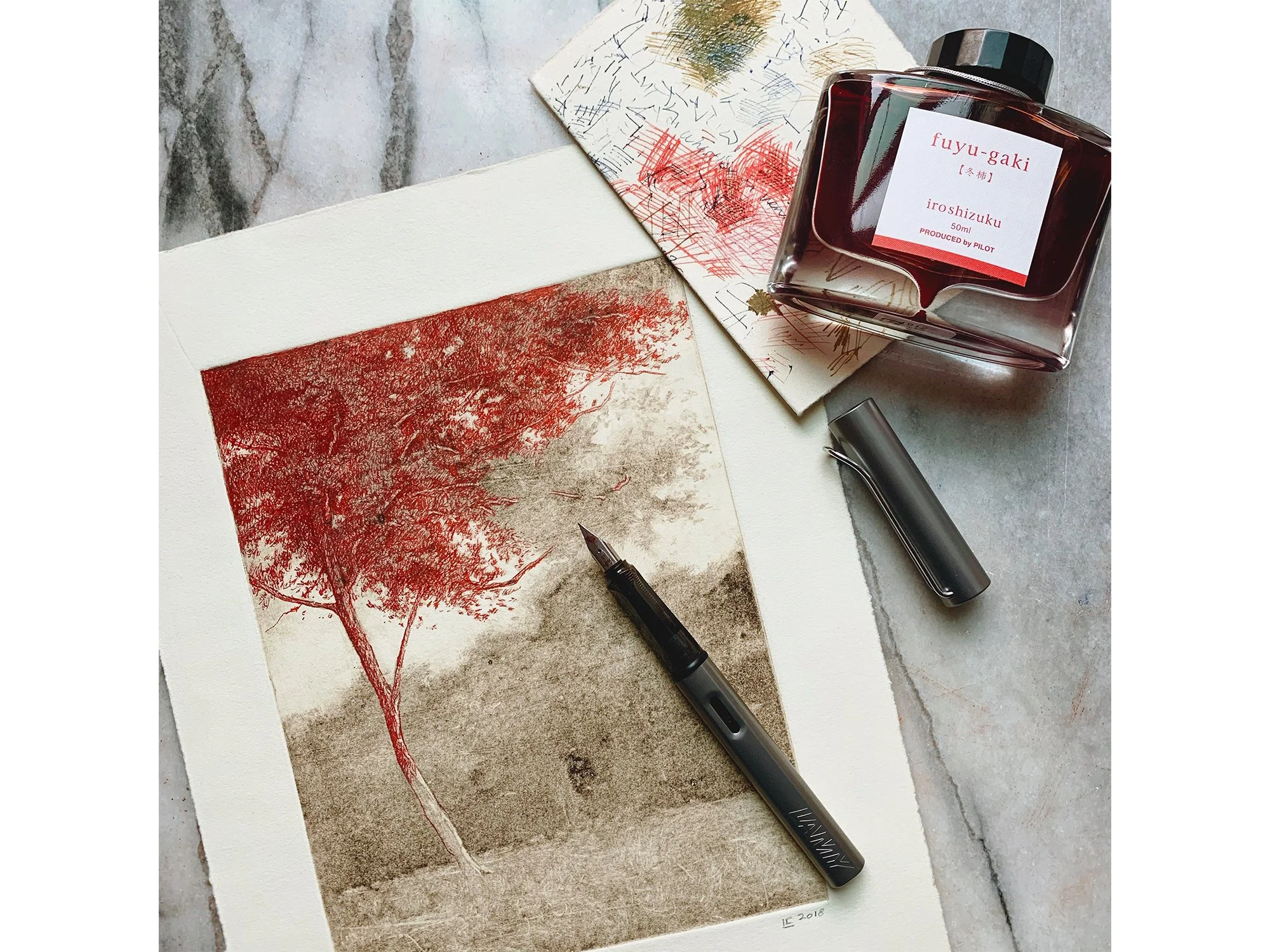
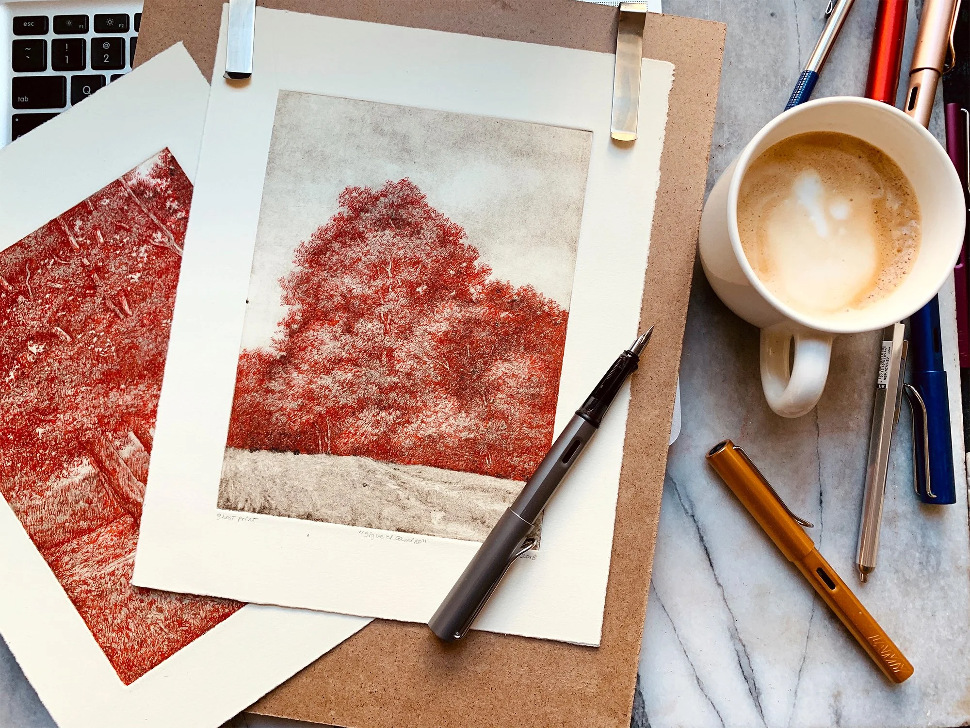
I began creating landscapes in bright red ink—a hue entirely unnatural for a subject usually rendered in greens and earth tones. The choice felt radical, almost disorienting, and perfectly aligned with the exhibition’s theme of uncharted territory.
How would a “bloody red” landscape be received? Would it provoke discomfort, or something else? To my surprise, the drawings emerged as warm and even welcoming, a paradox I still can’t quite explain. I’ve completed only four red ink drawings so far, but I feel strongly that this is a direction I’ll continue to explore—allowing the work to lead me somewhere new.
August 27, 2025
Looking back, I see how the red drawings continued to evolve beyond 2020. The color even found its way into my sketchbook pages. Interestingly, these works—the ghost print drawings and the red sketches—have sparked the strongest reactions online, often drawing the most feedback and engagement. In hindsight, the question I asked myself in this original post—how would a “bloody red” landscape be received?—has been answered with resounding positivity.
Rereading this now, I can’t help but feel a certain melancholy. Those were uncertain, even frightening days, yet they were also a profoundly important and prolific time for my practice. I think often of my fellow artist friends from The QNS Collective—of their insights, encouragement, and sharp observations that always pushed me further. Each of them is a deeply talented and inspiring artist, and I remain grateful and honored to have been part of that circle.
I’ll close this repost with the original four red drawings I created in 2020—the “COVID year”—a time none of us will ever forget, but one that reshaped my work in ways I continue to carry forward.
Top Left: Young Oak, 2020, pen and ink over monotype ghost print on Rives Heavyweight paper, image 8 x 6 inches, sheet 11 x 8 1/2 inches
Top Right: Arbolado XVII, 2020, pen and ink over monotype ghost print on Rives Heavyweight paper, image 8 x 6 inches, sheet 11 x 8 1/2 inches
Bottom Left: Untitled No. 4, 2020, pen and ink over monotype ghost print on Rives Heavyweight paper, image 8 x 6 inches, sheet 11 x 8 1/2 inches
Bottom Right: Sigue el Camino, 2020, pen and ink over monotype ghost print on Rives Heavyweight paper, image 8 x 6 inches, sheet 11 x 8 1/2 inches

